We’re so very close to the US elections that it’s pretty hard not to think about it — or gripe, complain, or whatever you think about the candidates. In the spirit of the elections, here’s part 2 of the best political website designs around.
Just like in the previous post, the designs listed are not necessarily from those that are currently running for an office in this election; rather, it’s a collection of those that I deem to have some sort of influence in today’s culture.
Without further adieu, here’s part 2 of the best political website designs.
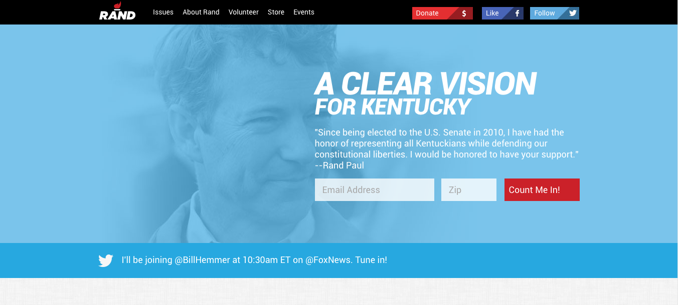
Rand Paul
Rand Paul’s website looks pretty tight and solid. CSS animations when scrolled; good use of whitespace and colors for readability; CTAs positioned in a decent manner that will help with getting users engaged.
I like his use of several hues of blues throughout the site, and the splashes of red creates that overall brand vibe. Using white as the background does give the site that good ol’ U.S. of A feel, which is pretty common in the political world.
I also like the subtle background texture in the about page.
While I think that his site is pretty decent, I’d change a few things to help make it stand out above the others. 1) I’d enlarge the header and navigation section so that the logo, menu items and menu CTAs larger throughout the site. 2) I’d take out the white background on the about page and stick to the texture as the background treatment. That may not be what others would suggest, but I would A/B test that and see how readers react. I’d also make the spacing in between paragraphs more consistent.
In the home page, I’d consider getting new feature images for each blog post. But hey, that’s just me 🙂
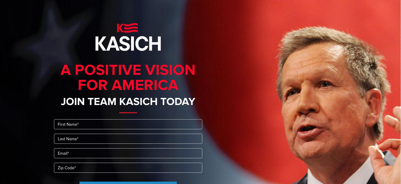
John Kasich
John Kasich’s website looks legit. Clean, crisp, with a few flashes of modern web design flair here and there. I like the endorsement map feature and functionality, which I think some of the candidates should have implemented on their websites.
Great use of whitespace and white backgrounds, and I love that he mixes subtle background textures with the red and blue backgrounds. It’s not the White House or Obama’s minimalistic style, but it does create a good balance of readability and style.
If there’s one thing I would change, I would make sure that the Donate button on the top menu is consistent throughout all pages. It’s missing on the endorsement page, but I assume that’s probably due to the map and conflicting scripts?
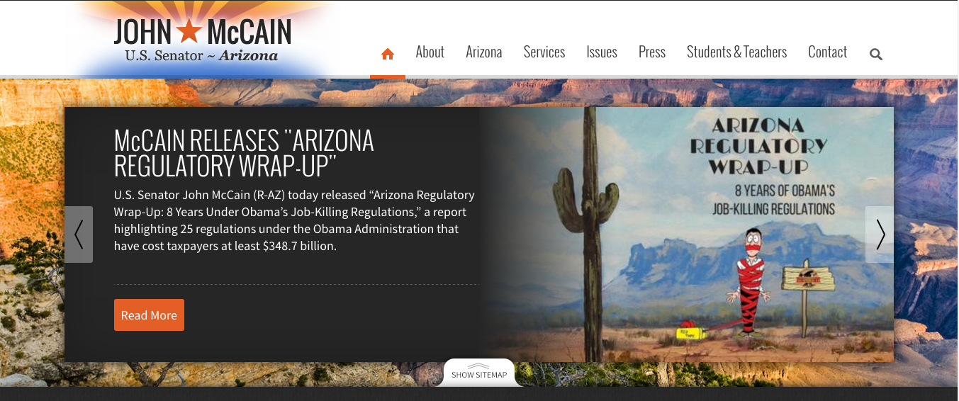
John McCain
John McCain’s site is very different from the rest of the designs I’ve included, and I did so with a good purpose. I like that he contrasts the designs and I wanted to pinpoint some good things and a couple of improvements and opportunities that his site has.
For starters, there’s some legitimacy to his layout design and functionality. Having a static menu can provide easier access to navigation, especially for those that are technically-challenged. Not necessarily a big fan of static backgrounds for the most part, but I think in this instance it works well. The background provides ample color and gives its readers a taste of what Arizona is like.
I like the “What’s Happening in Your County” feature. I think it adds a lot of value to county residents and really shows how those counties are being affected by state and national laws. I’d love to see this type of feature in a national scale, especially when it comes to hot topics like abortion, healthcare, gun laws, etc. It would definitely put a more transparent view to causes that affect our country.
The footer is pretty tight, and reminds me of some of the bigger footers that I’ve seen with the option to expand as needed.
With that said, I think if I could change anything from his site, I would take out the static background and keep the background light and fresh, or opt for subtle background texture treatments instead. Another thought is to keep the background but take out its static functionality, and then make the background more transparent.
I’d also let the page breathe by giving it more space between sections and letting users scroll down through the page.
I could go on, but then, it may not stop 🙂

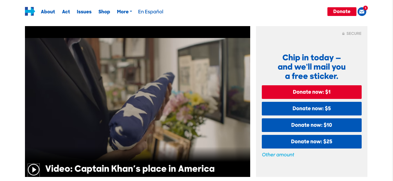
Hillary Clinton
Hillary Clinton’s website has some very good features and strong actionable (and engaging) elements.
For starters, the home page is chock full of engagement: from a strong donation placement to the countdown ticker to the autoplay video (and I totally hate that I can’t stop this stupid thing), things are looking up and up.
Just like Obama’s site, it’s got a great sense of whitespace. It also mixes in light grays for background content sections, dark background colors to separate light content areas and spaces, and even combines the black and royal blue in the footer to create that stark contrast, drawing the eye towards that design.
Great use of highlight as well, using the royal blue-ish as the highlight color. Even the use of its menu navigation is great. Instead of the typical “about us” verbiage, the nav uses more actionable calls like “act.”
If I had to change something, I’d make the logo and navigation area a bit bigger, and add just a tad bit padding on the top and bottom to create space between the ticker and header/hero area. I’d also do the same on other pages.
I hope that this list either makes you think of more designs to share, or tell me about how you would make things different or change things around on their website.
I hope that, if anything, helps you think more objectively to how these designs are and how they affect the users in its design and purpose.
As the election finally ends, I hope that we all put aside our differences and come together as countrymen to actually hold the people we vote for accountable for their actions, their promises, and their responsibilities to the American people and the allies of the United States.
God bless!
~ Love posts like this? Contact me if you need help with your marketing or design needs, subscribe to my emails, or connect with me on LinkedIn!
