
It’s almost election time, and boy it is an election year to remember. Aside from all the hooplas about emails and walls, and whether or not you’re leaning towards one party or another, you have to admit that this election year is very interesting to listen to and watch.
I don’t like to mix politics and my work, but I do know of one aspect of my work that may blend the two together beautifully. Since I do web design work, I think it would be cool to showcase some of the best website designs from politicians around.
After all, it is election year right?
Now, I’m not going to show partiality towards any party or group. My research was based on pure web design best practices and appeal, and I think I covered various different parties and political figures.
A few of these designs are from those who isn’t running in any high-profile campaigns (at least not anymore), but I included them as I still see them as a political figure to watch and/or someone of political influence.
I think you’ll find some of these may or may not fit your taste. If you have any comments to add about the designs of choice, don’t hesitate to add them! Please, no rude comments or all that politics bollocks.
Yes, I said bollocks 🙂 Go IT Crowd 🙂
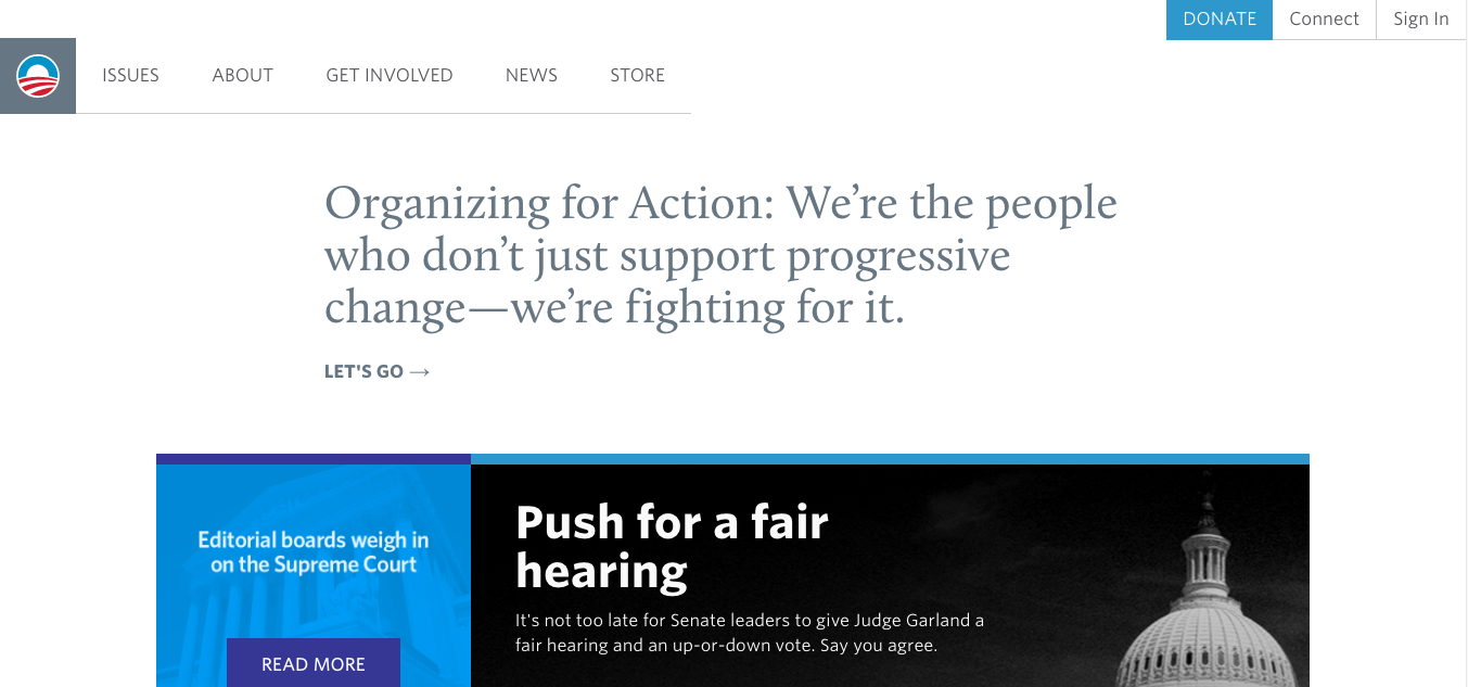
Barack Obama
The current president (at this time of writing this post) has a very modern website with a very minimal feel to the design. Lots of whitespace to create space and openness to the content while using colors and images for contrast and splash.
The navigation is also pretty cool, opting for a minimal left hand menu nav separating it from the secondary nav items which are statically placed on the top right. The main menu retracts to the logo as you scroll down the site, leaving room for more content reading.
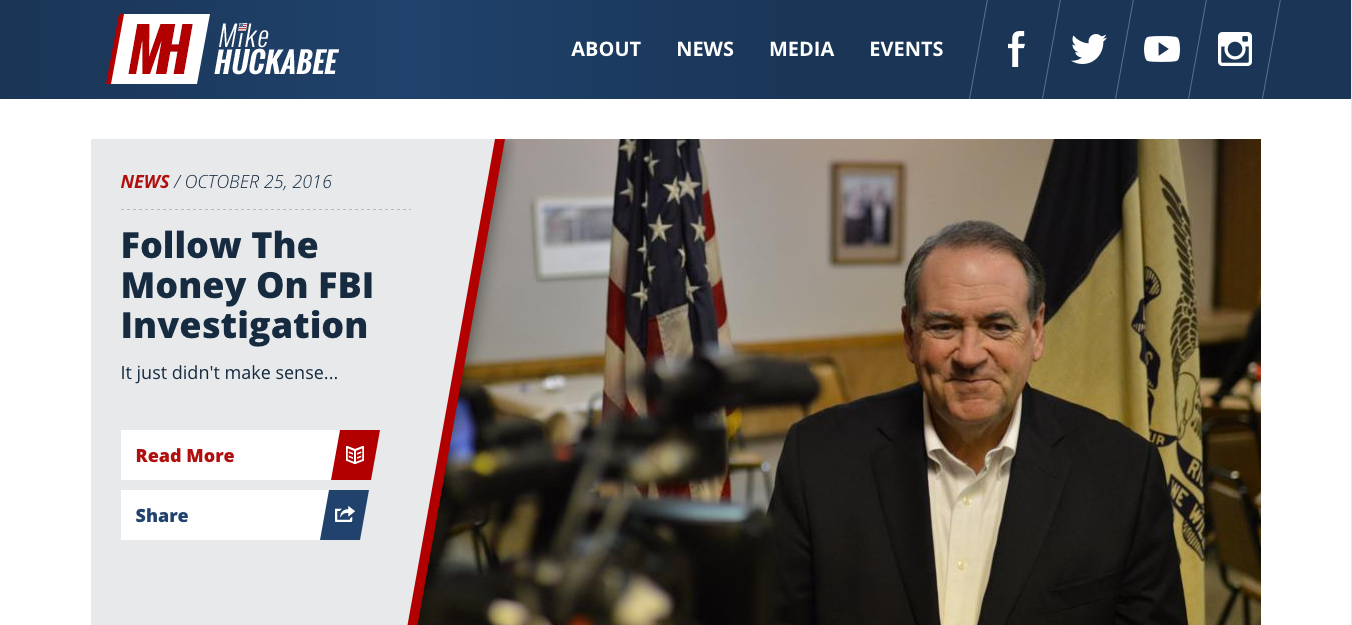
Mike Huckabee
I think Mike Huckabee’s site is above average in a lot of ways, but also pretty great in some areas. Great mixture of branded color and whitespace, although not as white/minimalistic as Obama’s. There’s more of a happy medium of both branded colors and whitespace, and thus emphasizes more of his tone, character and branded value.
I like that the site uses sizable images and sections on the top to compliment the whitespace around, and do so without overpowering it. Great use of the light and dark blue hues to emphasize different sections of the site.
One thing I would do is to take out the gray background on text-heavy pages (see About page) and just leave the dark text with the white background. That would give it better readability and encourage openness to the page.
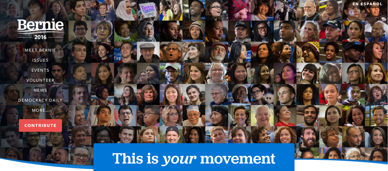
Bernie Sanders
Bernie Sanders’ website is very intriguing and engaging, as if it’s actually helping me make my choice to vote quite easily.
Unlike other websites like Mike Huckabee’s, Bernie’s site starts out with moving, emotional content that lures you to reading more. Instead of a top navigation area that most politicians use, Bernie opts for the side navigation. I wonder if this is because he really wants to make a point to be different, or just for functionality sake?
Sections of the site are stylistically “sectioned” off by using strong call to action areas with his signature blue background color. Every other section is then painted with white or a light gray background to further accentuate that section.
This separation of sections with CTA areas and light background colors are great for subtle section changes, especially in readability. I really like the use of the CTAs and I think it’s a great way to encourage engagement with its user base.
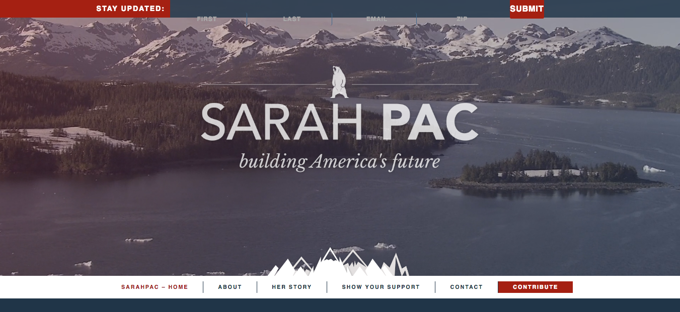
Sarah Palin
Sarah Palin’s website looks pretty decent. Once you get past the modal area when you first land on her home page, the beginning video in the hero area is tight, and the parallax-type mountains as you scroll down is a “neat” feature.
Her use of full width images in the hero and in the news section is contrasted by the fact that her text placements are in the middle with ample whitespace to each side.
Upon skimming through the rest of the site, it looks fairly clean and decent. I would improve certain aspects of the site, like increasing whitespace use, image placement and sizes, and better use and highlighting of CTAs. I don’t think her site is too bad (there are a lot of others out there that are worse), but I think hers does the job fine.
I’m not sure if their newsletter sign-up bar is positioned properly but as you can see from the screenshot, the fields are way off. I could blame it on my Disconnect app on Chrome, but chances are that it may not be me.
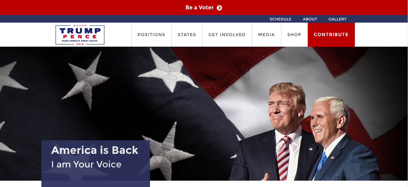
Donald Trump
Now, I know what some of you are thinking, so don’t even think about it. Keep it clean, boys and girls.
Mr. Trump’s website is clean and crips, like several of the key sites listed here. He uses a lot of the American flag colors (in varying hues) that I’m sure plays well with his emphasis on making America great again.
I like the mix of white colors and off-white textures for his text backgrounds, and his sections and layout on his homepage is very solid.
Like a lot of the websites you’ll see here, the Contribute or Donate button will always get special treatments, and Trump’s CTA is no different. I will say tho that his site is a lot cleaner than Ms. Palin’s.
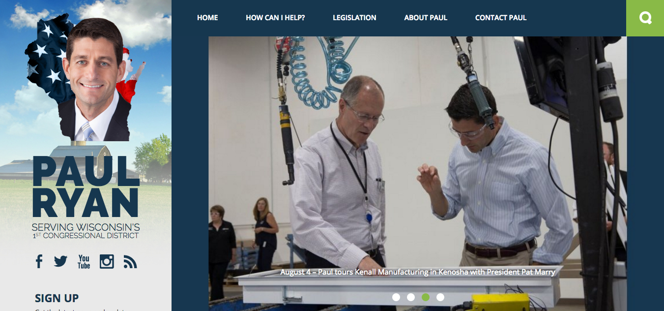
Paul Ryan
Paul Ryan’s website is probably one of the black sheep of this bunch, as it uses both left and top menu navigations throughout his website.
The site has a pinterest-esque feel to it, as seen by the lack of whitespace in between sections and the card-like layout scheme of the blog posts. The blue and green color scheme plays out nicely, although I think they can do a bit better on incorporating secondary colors into the equation.
I think being different is totally fine, and Paul Ryan’s team does a decent job of making their site stand out from the rest. If I can change two things from their site, I would add more white space to separate out the content and make it easier to transition into sections, and just choose one main navigation: either top or side.
Hope you enjoy this first round of best political website designs. In the next post, I’ll continue showcasing the rest of the best political website designs.
Love this post? Be sure to connect with me on LinkedIn and contact me if you need any help with your design or marketing needs.
