It’s been several weeks now since iOS7 launched for the iPhone, and unlike many bloggers, I wanted to wait a little longer to really see and play with it before I write a review about it. More than just the features and superficial stuff that most would have written about after the launch (or even before it), I wanted to write about the deeper goodies issues that come with the new version. Some bloggers have already touched on the pros and cons, and I know that after more extensive use of the version, more will come in the future.
The extent of my review is primarily based on comparison between my old iPhone 3GS with iOS6 and my iPhone 4 with iOS7. I’m sure that there are a lot to nuances to compare with these versions, and am also sure that there is a bigger comparison between an iPhone 4 and iPhone 5 with the same OS. Regardless of that, I hope that this would be an biased unbiased view of the software, for good or for bad.
What I Love
The Flat Design
The flat design does provide a good job in making the usability and user experience of the iPhone much better. It brings clarity, cleanliness and brightness to the experience.
I know that many will say that they’re not used to the flat design, or even sarcastically stating how “old school” the flat design is. But honestly, it isn’t a bad thing. The usability looks crisper, and the flat design does make the visual animation/transformation look cleaner. While I did like the beveled design on iOS6, the flatter design does make it look more like a modern, post-Web 2.0. Color schemes of the default Apple apps look clean and bright; the bright CTAs amidst the light background makes for a stronger contrast and easier to see what to do, and the lighter background seems to be a better option than the steel blue gray-ish tone.
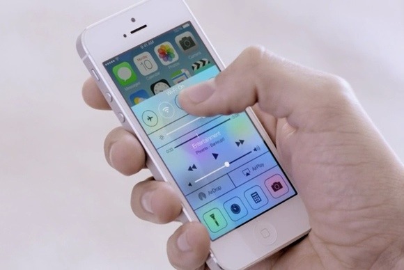
Control Center
Just like in web design/UX, too many clickthroughs can cause a user to disengage with you and say NAMASTE to your beautiful self, and they will be riding away into the sunset of “not seeing you ever again” into the arms of your competitors. Sadly, the old iOS was like that in a lot of ways. I had to click on Settings to modify my wireless and control Airplane Mode (um yeah, you know, because I travel a lot for my work because I have tons of money to do so), go find my flashlight app, search for my timer/clock app (because it’s somewhere in my netherworld of app folders), double click my home app and turn off my orientation, etc. You get the drift.
It was such a pain, but because I have an iPhone – which I am grateful to just have one – I had to deal.
The new iOS changed all of that, and believe me it’s WAY easier. With one swipe of my finger, I can find several of the necessary apps I need in a fairly easy fashion. Gone is the need to double-click the home app to turn off your volume (not like you couldn’t do it on the side of the phone) or even modify your screen orientation. They’re all in the control center, including these other fine app settings:
- Airplane Mode
- Wireless
- Bluetooth
- Do Not Disturb
- Volume Control
- Flashlight
- Calculator
- Camera
I thought about deleting my flashlight app and just go for the native one, but since Apple screwed up their MAP strategy when they dumped Google, I may think about just keeping that for now. You know, just in case they screw up.
Lame joke: How many Apple guys will it take to screw up a native Apple flashlight app? Let’s just hope it wasn’t the group that screwed up the map. Otherwise, the world may never know. Yet.
Helvetica Neue
I. Love. Helvetica Neue.
Love this font. It’s a crisp, clean and modern typography, and its use is clearly an emphasis of Apple’s use of modern design on all of their products. The font is lightweight, providing an open space to the design and gives a good breathing room to the system’s visual elements. Even the use of this font on the native apps feel lighter on the eye. And if you consider the design with the typography, it makes the experience a whole lot better.
Blocked Calls
Can I hear an AMEN to this? I absolutely hate tele-frickin-marketers and spammers with a passion (and please don’t mistake us marketers from TELE-marketers), and this nifty functionality is what I have been dying to have for the last three years. Instead of just screening your calls, you can now block calls, text and facetime from those whom you would rather not talk to you. At all. Forever.
Here’s how you block calls:
- Click on the information icon next to the received caller (or in some cases, the icon next to an existing contact)
- Scroll down to the end of the screen and click on “Block this Caller”
- You get a warning that by choosing to block this caller, you will not receive messages, calls or Facetime
- Click “Block Contact” to block that funkdafied schizzo
- Your problems are over
Upgraded Native Apps
With the new iOS, the native Apple apps also got a facelift. Native apps like the Contacts, Notes, and Reminders definitely benefited from the flat design. You can tell especially how the design change impacts the use or uselessness of the app. Case in point is my Notes app. That old school legal pad background is replaced with a cleaner style, which I think it’s supposed to look like a college-rule or wide-rule paper. Even the calendar looks strikingly more handsome. It’s less cluttered, which creates more space for your data to be seen, and thus give them breathing room.
[gpp_divider type=”dashed” color=”grey”]
What I Hate
Suck My Battery
The iPhone wasn’t really known for a great battery life, and I find that the new OS isn’t going to make things easier for my battery. During my first week of use, I found myself having to charge my iPhone on a more frequent basis. Apps that I normally had location services turned on with the old OS are now turned off, save for a very small handful that I know are very necessary for me to keep. To say the least, I had to turn off a lot of “unnecessary” functionality (location, notification, photo streaming – you get the drift) so I can save some extra juice. And that’s just with an iPhone 4. I can’t imagine what it would be like for the iPhone 5 and up.
The Flat Design
The flat design had its pros and its cons. The rounded corners on the main screens looked fine with the beveled design of the older OS, but it doesn’t look as tight with the flat design. The swag is off, especially when I see the native and non-native apps side by side. It just doesn’t mix. Maybe this will put the pressure on other apps to convert to a new app design, or at least an app icon that has a flatter design.
Email Snafu
So check this out. The native email app screwed up 2 Gmail accounts and a Hotmail account. I marked emails as read on the mail app, closed it and went on my merry way. The next time I looked at my mail, the number of unread mail doubled on my home screen, and I wasn’t able to get that down on my phone. I marked all as read AGAIN, waited for the mail app to save and closed the app. The third time I looked, the number of unread messages had now TRIPLED.
After 2 hours (Yes, I worked on fixing my phone for that long) of trying to figure out what in the world to do, I finally just logged into my laptop and started to mark everything as read from there. Thankfully, that method worked, but who knew what would happen if that didn’t?
“Login password authentication UI”
I think the login buttons are bigger and rounder, which makes it easy for someone looking over your shoulder to know the password. Not that older versions would ever stop a determined person from peeking or trying. The confirmation buttons on the top of the digits are very small in comparison to the older version, which makes it even harder to know if you actually entered a number or not. Half the time I think I pressed the button and am waiting for the phone to let me in, only to wait and think I’ll just restart again because I have a hard time seeing if the button confirmations are active or not. I’m not sure if it’s the transparency of the buttons in the home page, but it can get very tricky to log in. Yes, it may seem nice to look at, but it’s harder to tell whether or not you entered the wrong number until you actually get denied.
Useless Native Apps I Can’t Delete
Ok, so I am exaggerating. I can delete them when plugged into my laptop, fine. What I hate is that I can’t do that on my phone, and thanks to Microsoft, Apple is has joined the bundling method and making it hard for me to delete apps that I don’t fricking want. Newstand? Um no, don’t want, thanks. Passbook? Why do I need this?? Reminders and Notes? I’d rather get other apps that are far better in UI and functionality than these.
OS Updates
Ok, being from Seattle, I understand technology. I get it. Technology is in the blood of Seattle for decades, and I have been exposed to that since I was very young. Again, I get technology.
I also get the fact that in technology, you have to keep updating your systems to make it work for today. Yes, I understand that. What I don’t get is if why is the software update only 50MB but the requirements to update the OS is 1.5GB (yes, THAT GB)? I tried to ask that question over the phone to an Apple “Genius” (I use that term loosely, btw), and the guy that I talked to basically gave me the “I’m not qualified to answer that question” answer without really saying it.
Yup, genius.
Conclusion
There are definitely some things you can take away from the update that are super important and can actually help your daily life better. My personal vote by far is the blocked calls feature, which is fab for telling whack MLMers, telemarketers and spammers to go to sleep. There are nuances, of course, to this update, but if you’re already used to the iPhone, some of these nuances wouldn’t be such a big deal, except to just get used to it.
If you have been testing out the new OS, what would you say are the good and bad things about it?